Origin Story In-House Brand Design UX
GoTrack
by GoSweetSpot

The project where working inside a brand from the ground up revealed the process that became An Ideas Merchant.

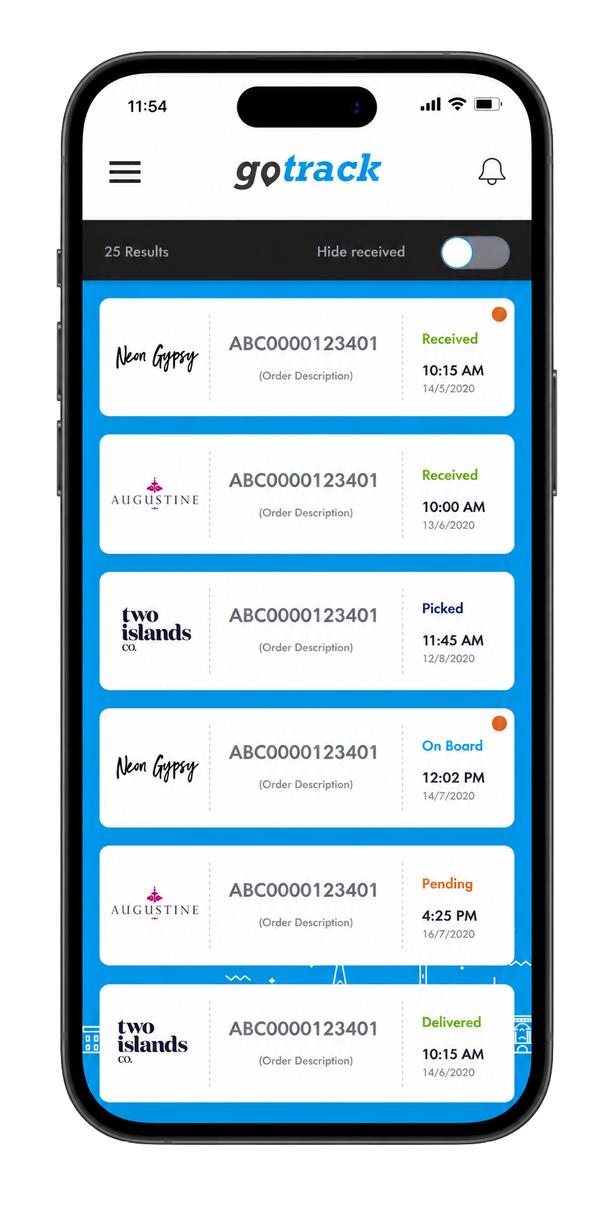
The GoTrack app showing a live parcel tracking list GoTrack app icon
10K+
Android Downloads
~20K
Est. Total Reach
2
Stores. Shipped.
My Role
In-House Brand Designer
Scope
Brand Strategy & UX Design
Output
App Design, Brand Extension
Platform
iOS & Google Play
Client
GoSweetSpot, Auckland NZ

The Origin

Where An Ideas Merchant began.

Working as the in-house brand designer at GoSweetSpot gave me something valuable: full visibility across a brand from the inside. I was responsible for the visual identity, the content strategy, the positioning, and the way the brand spoke across every touchpoint.

That role revealed something I have carried into every project since. The brief is rarely the real problem. Getting to the root of what a brand is actually trying to do, who it is really for, and what it genuinely needs to say requires a structured process. Not just instinct. Not just taste. A repeatable framework.

GoTrack was where that understanding crystallised. I mapped the user journey across four distinct user types, identified the real gaps, and designed a product that addressed them. That process became the foundation for everything An Ideas Merchant does today.


GoTrack did not start as an app brief. It started as a brand strategy question: who is actually experiencing this product, and what do they need? Everything followed from that.
Aidan · An Ideas Merchant
01The Problem

Congested support lines, delayed deliveries, customers left in the dark.

GoSweetSpot handled the logistics well for their B2B clients. But the people on the receiving end had no clean, contained way to track what was coming, or what they had sent, without endlessly searching emails. The experience was fragmented at the most critical moment in any transaction. That gap was the brief.

02The Process

Map the full journey before designing a single screen.

A user journey mapping exercise across four user types: B2B clients, B2C shoppers, delivery drivers, and end recipients. Each had different discovery patterns, pain points and needs. Mapping them together revealed the architecture for an app that could serve all of them. That map became the brief.

03The Outcome

A shipped product. Two stores. Tens of thousands of users.

GoTrack shipped to both the Apple App Store and Google Play. Android alone shows 10,000 verified downloads, with Apple bringing estimated total reach to 15,000 to 20,000 users. Strategy that started on a whiteboard became infrastructure for thousands of New Zealand businesses.

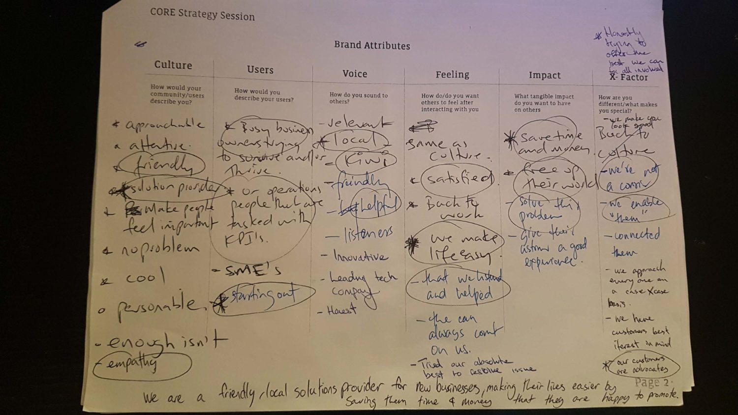
The original CORE strategy session worksheet, brand attributes filled in by hand

Strategy

The strategy, before the screens.

A CORE strategy session with the GoSweetSpot team, run on paper, before a single pixel. Six lenses turned instinct into a shared, repeatable definition of who the brand is, and refuses to be.

Brand Attributes

CultureHow would your users describe you?

  • Friendly
  • Solutions Provider
  • Empathy

UsersHow would you describe your users?

  • Business Owners
  • Operations Staff
  • Start-ups

VoiceHow do you sound to others?

  • Local
  • Kiwi
  • Helpful

FeelingHow do you want others to feel?

  • Satisfied
  • At ease
  • Resolved

ImpactWhat tangible impact do you have?

  • Economical
  • Freed
  • Resolved

X FactorWhat makes you different?

  • We're not a courier
  • Enablers
  • Customers are advocates

Value Proposition

“We are a friendly solutions provider for growing businesses, making their lives easier by saving them time & money.”
GoSweetSpot

The Mark

A sub-brand, carried in motion.

GoTrack had to read as its own product, yet unmistakably belong to GoSweetSpot. The mark is derived directly from the parent lockup, same weight, same warmth, then set in italic to convey motion: a parcel already on its way.

GoSweetSpot parent logo Parent brand
GoTrack derived logo Derived sub-brand
The stylised o as a location marker
The stylised “o”

The letterform doubles as a location marker: tracking, built into the name itself.

Paper plane
Paper plane

A parcel in flight: light, fast, effortless. The signal that something is on its way.

Trail lines

A dashed flight path traces the journey: the route a parcel takes from send to arrival.

GoTrack app icon
App icon

Every element resolves into one mark: pin, plane and trail, set on GoSweetSpot blue.

The App

Clarity, in the hand.

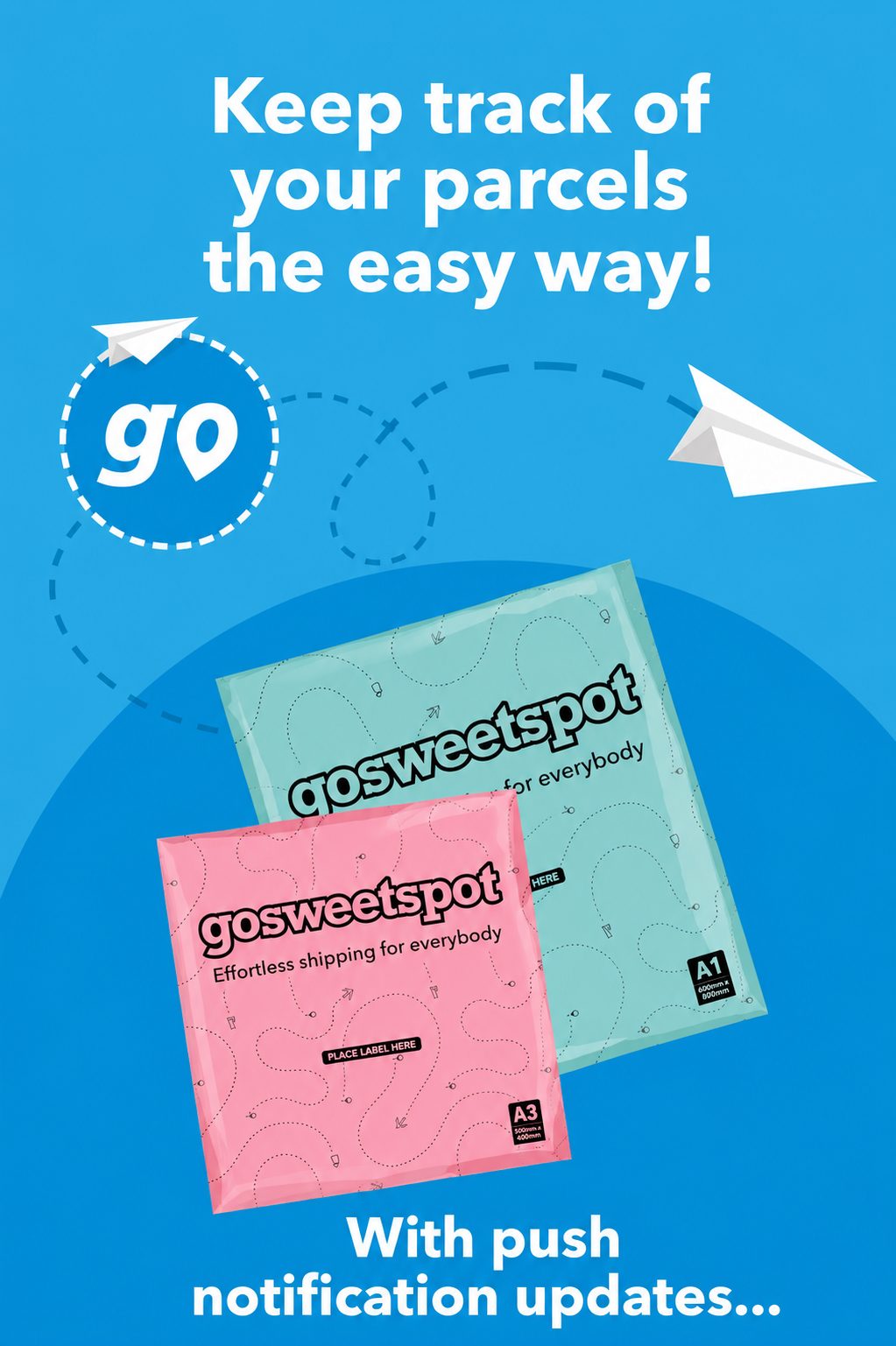
Keep track of your parcels the easy way
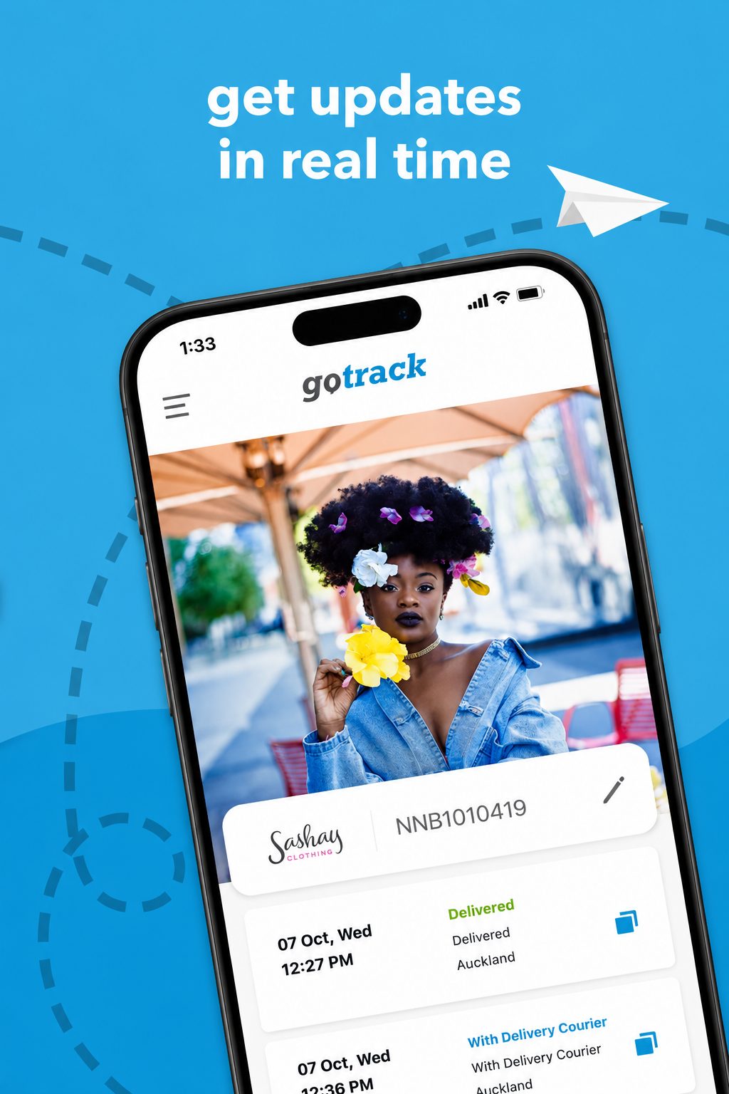
Get updates in real time, the GoTrack tracking screen
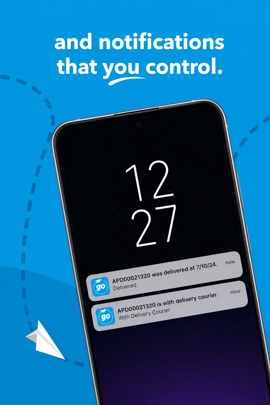
Notifications that you control
GoTrack parcel list with status per shipment

One screen, every parcel

Status at a glance, for everyone in the chain.

Received, picked, on board, pending, delivered: colour-coded and contained. The fragmented email hunt became a single, calm list that B2B clients, shoppers and recipients could all read the same way.

In closing

This is what happens when strategy comes before execution.

An Ideas Merchant exists to bring this kind of clarity to every project. GoTrack is where that understanding began.